Introduction
How wide is wide? And what’s the best width to use for your email marketing campaigns? Many marketers have pondered this question, only to be met with confusing answers that feel outdated.
Let’s dive in and discover if you should go big, or go home with the width of your email marketing campaigns. We’ll examine the question through a modern lens and provide you the most up-to-date advice.
Chapter 1
Microsoft Outlook and the legacy of 600 pixels
Over a decade ago, Microsoft Outlook was the king of the email client hill and the average desktop monitor was 1024px. Marketers around the world had to conform their emails to deal with these constraints. It was from these constraints, that the email width rule of 600 pixels was born and since then, it has largely prospered.
But, a lot has changed. Just consider these stats:
- 97% of screen resolutions are 1024×768 pixels or higher
- 1366×768 is the most popular resolution at the time of publishing this post
- 53% of email is actually opened on mobile devices – 26% on iPhone alone
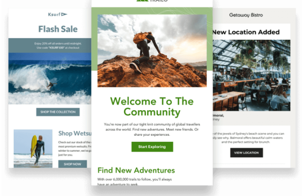
Because of stats like these, we’ve witnessed a revolution in email marketing — a revolution in design. More and more marketers want their emails to look like websites. In fact, many of our customers are on the leading edge of this revolution. The world’s highest-performing email campaigns are full of big, bold, full-width hero images. So how do these marketers do it?
Chapter 2
How wide should your emails be?
We reached out to a couple of email experts to get their take on email widths and here’s what we heard.
Email banner size specifications
Elliot Ross from Action Rocket writes, “We’ve been experimenting with wider emails. Our weekly email tops out at 960px wide, and goes from 3 cols to 2 to 1 depending on subscribers screen sizes.”
We checked out Action Rocket’s email on our Apple Thunderbolt monitor. Sure enough, it looked sharp as a tack and that yellow background color in the main section stretched full width.
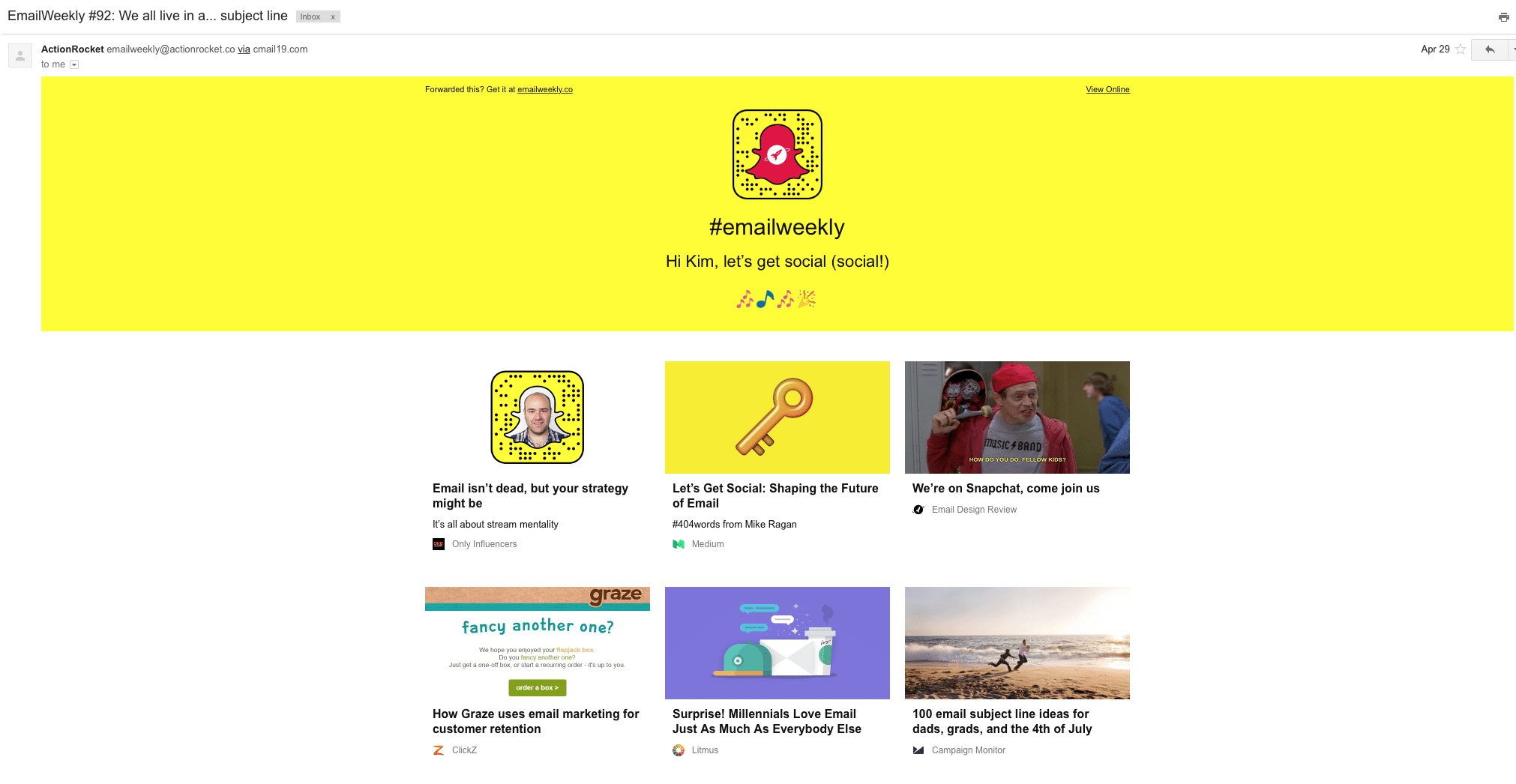
Then we adjusted our screen size and responsiveness kicked in adjusting seamlessly.
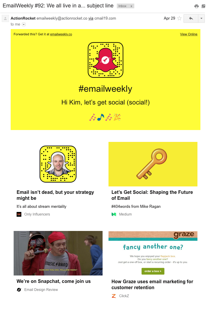
It’s important to note, however, that at widths wider than 640px that Gmail doesn’t show any background color that would appear in the margins at most reasonable browser sizes (you can see them if you stretch your browser to wider than 1200px).
Plus, email clients don’t use the full width of your screen to display an email message. Some show ads or have navigation or a menu so there are limitations to the real estate on a screen.
So, if you want your email to render well in every email client, it seems we can push the envelope on our email widths a bit further to at least 640 pixels. And if you want to go even further, you can use background colors to stretch full-width, like the yellow band in the Action Rocket email – just know that some clients may not show it.
Stig Morten Myre, our own email developer at Campaign Monitor, advises that the age-old 600-pixel recommendation is still a useful guideline, although not a hard and fast rule.
“If your email is mobile-friendly, that generally means it doesnʼt just have a single width for everyone. So the number weʼre talking about here is really the maximum width it will be displayed at.
To decide on that number, there are a few things you can look at. Which email clients do your subscribers open their emails in? Does your email adapt to the width of those email clients, or could it end up with horizontal scrolling if the email is too wide?
Also, consider the line length of your text. A common recommendation is to stay within a range of 45-75 characters per line. So if your font size is the same on mobile as in the full desktop version, you can aim for the minimum width to fit approximately 45 characters per line, and 75 or so characters per line at the maximum width. Again, these are only guidelines, but it can be a useful angle to approach your email design from.”
When designing our free email templates, Stig and team took this into account, making the layouts display at a 600-pixel width on desktop and 320 pixels on mobile, to ensure emails will look awesome in every client and on every device.
At Campaign Monitor, we’re proud to enable our customers to lead the revolution in email marketing. You can choose an email template across a number of different categories (announcements, newsletters, deals & offers, feedback, events, holidays, reengagement, welcome) to start editing, or design a template with your branding in our drag-and-drop builder.
Chapter 3
How to create a full-width email using Campaign Monitor
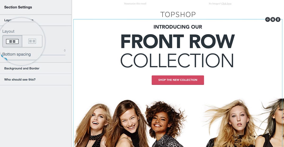
Campaign Monitor enables your emails to flow full-width across the screen when you choose a one-column layout in our email builder.
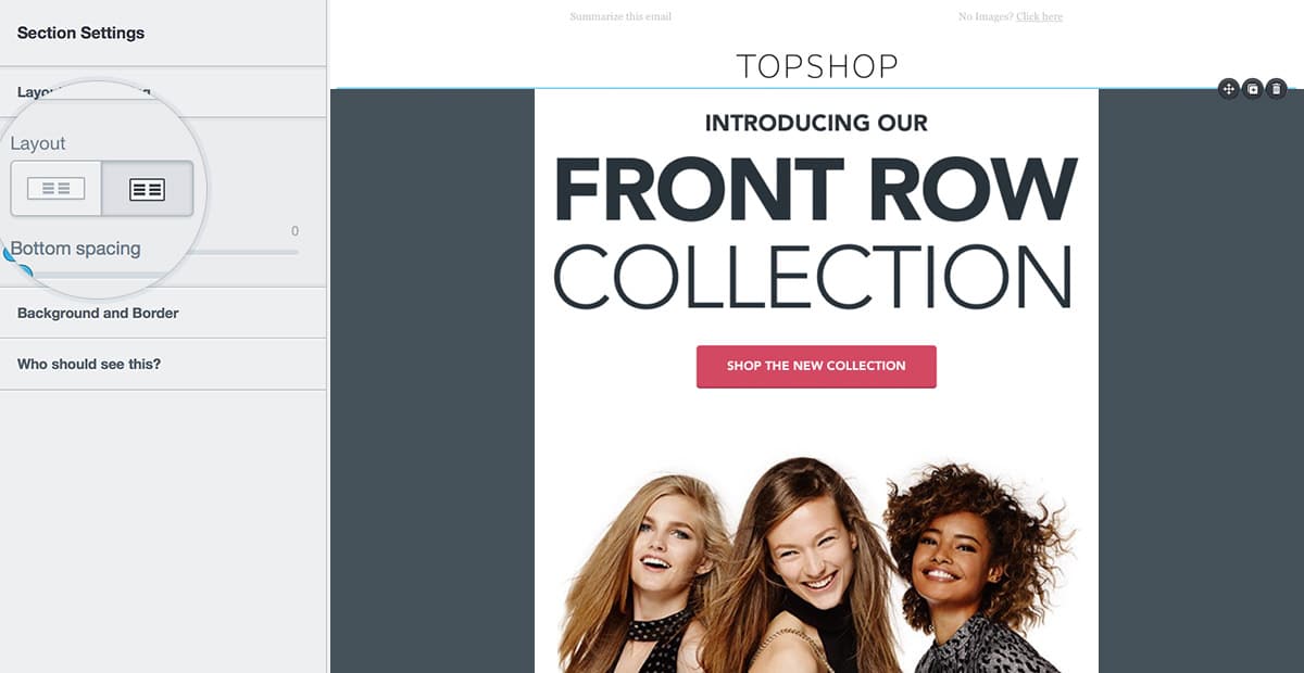
You can then amp up the volume and “color outside the lines” by using background colors and images to go full-width and give your email a modern look and feel that echoes a website.
Inspiring examples of full-width emails
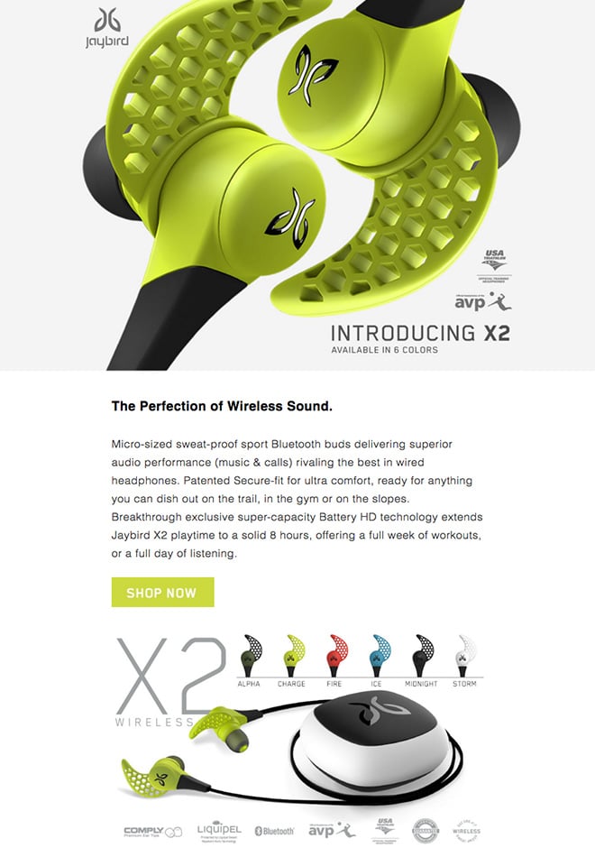
Jaybird
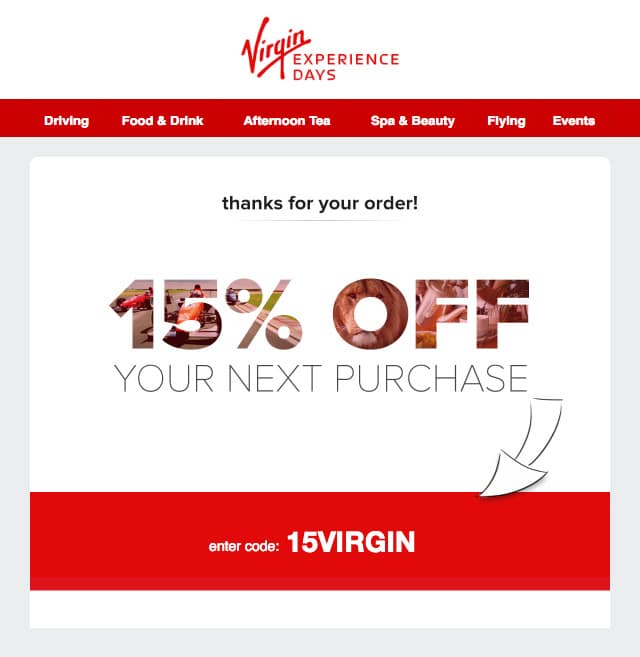
Virgin Experience Days
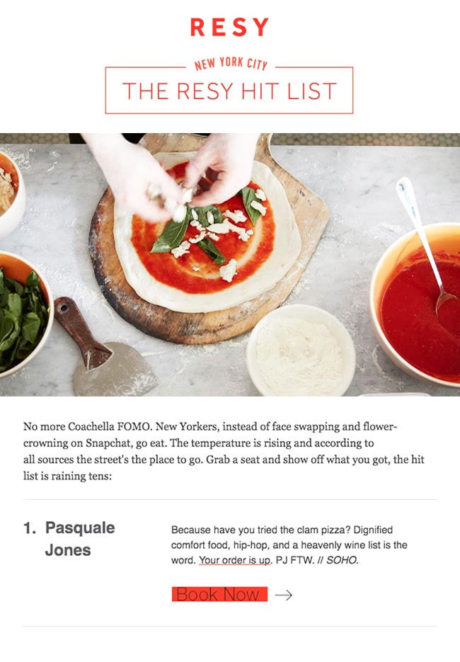
Resy
SXSW

BuzzFeed

Chapter 5
What about height?
If you’re searching for the ideal image width, it’s more than likely you may also be wondering about the height. Keep in mind that it’s always a best practice to keep the most important text above the fold, or where your reader can see it without scrolling further.
The preview pane for “above the fold” text is usually between 300 and 500 pixels high, but of course, your email can be as high and contain as much content as needed to convey your message.
Chapter 6
Wrap up
As you can see from the advice and examples in this post, modern marketers are leading the revolution in email marketing and continuing to push the boundaries with email width and so should you.

Press CMD+D to Bookmark this page

Build engaging emails that get results
Assemble an eye-catching, high-impact email in moments with our drag-and-drop email builder.
Learn more
Case Study
With hyper-personalized emails, Bluetent experiences huge wins in the hospitality space.
Learn how
The email platform for agencies
We started out helping agencies with email, so let us help you.
